Diseñar herramientas Flujo de trabajo
Aprende acerca de las diversas herramientas Flujo de trabajo disponibles en App Builder.
Paleta de herramientas Flujo de trabajo
Todas las herramientas que agregaste al flujo de datos de tu aplicación en el panel Orquestar se pueden encontrar en la paleta Herramientas Flujo de trabajo en la pestaña Diseño. El número junto al nombre de la herramienta muestra cuántas herramientas existen. Puedes expandir y contraer las secciones de la herramienta con la flecha junto al nombre de la herramienta.
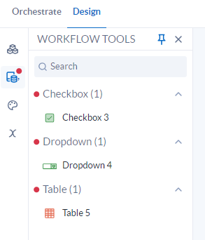 |
Figura: Panel de herramientas Flujo de trabajo con indicadores de notificación
Sugerencia
Cuando haya herramientas que se agregaron a la Orquestación de una aplicación que estén disponibles para usarlas en la paleta Herramientas Flujo de trabajo, aparecerá un indicador de notificación en el ícono Herramientas Flujo de trabajo y junto a las categorías de herramientas disponibles. Cuando se agreguen todas las herramientas al lienzo Diseño, el indicador de notificación desaparecerá.
Agregar o quitar herramientas
Para agregar una herramienta al lienzo, arrastra y suelta la herramienta desde la paleta Herramientas Flujo de trabajo en el lienzo. Para quitar una herramienta, selecciona el ícono de papelera .
.
Herramientas Interactivas
Herramientas Mostrar
Color
Selecciona opciones de color para ciertas Herramientas Flujo de trabajo. Para obtener más información sobre las opciones de color y cómo cambiar los colores de los temas, consulta Temas en App Builder.
Espaciado
Establece un espaciado personalizado para tus herramientas de flujo de trabajo Interactivas y Mostrar en App Builder. Ingresa el número de píxeles para agregar un margen a los lados Superior, Inferior, Izquierdo y Derecho de tu elemento.
Lógica condicional
Cada herramienta de la pestaña Diseño se puede configurar para mostrar solo si se cumple una determinada condición.
Selecciona opciones para OnlyShow If:
Selecciona una Variable.
Selecciona un Operador.
Selecciona un Valor, que es el valor que almacena la variable hasta que se cambia con una herramienta Establecer variables.