 Ferramenta Geração de Gráficos
 Ferramenta Geração de Gráficos
Aviso de descontinuação da ferramenta Geração de Gráficos
A ferramenta Geração de Gráficos foi descontinuada e substituída pela ferramenta Gráfico Interativo.
A ferramenta Geração de Gráficos permite exibir os dados em vários tipos de gráficos.
Configurar a ferramenta
Selecione o Tipo de gráfico. Acesse Tipos de gráfico para obter mais informações.
Selecionar os campos do gráfico: essa grade é preenchida com base no tipo de gráfico que você escolhe. A visualização à direita muda de acordo com as suas seleções.
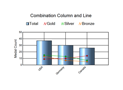
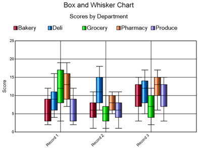
Série: uma série é um elemento do gráfico. Dependendo do tipo de gráfico, há várias séries com suporte. Cada série tem seu próprio controle para exibição. O exemplo de gráfico de combinação abaixo mostra um gráfico com quatro séries. Uma série é a coluna, e as outras três séries são linhas. O exemplo de gráfico de caixa e whisker tem cinco séries. Elas são as barras de cores individuais que representam os departamentos: padaria, delicatessen, mercearia, farmácia e produtos hortifrutigranjeiros.
Campo de rótulo: o que é exibido para cada registro a partir do qual você está gerando o gráfico. Para a maioria dos tipos de gráfico, ele aparece no eixo horizontal, como demonstrado nos dois exemplos acima. Os gráficos de barras e tornado exibem o rótulo do registro no eixo vertical.
Configurar aparência do gráfico: selecione o painel à esquerda para exibir as configurações individuais de exibição do gráfico. A visualização reflete as seleções que você escolhe.
Configurar aparência do gráfico
Geral: esse painel controla a aparência básica do gráfico.
Interior 3D: (Sim ou Não) adiciona a aparência de terceira dimensão ao gráfico.
Coloração de gradiente: selecione Sim para adicionar um efeito de gradiente ao gráfico. Selecione Não para definir o elemento do gráfico como uma cor sólida.
Largura (cm): dimensão horizontal do gráfico em suas configurações locais.
Altura (cm): dimensão vertical do gráfico nas configurações locais.
Resolução: especifique a resolução da imagem.
Título: especifique um título para o topo do gráfico.
Tamanho do título: especifique o tamanho da fonte para o texto do título em pontos.
Subtítulo: especifique um subtítulo para aninhar abaixo do título do topo do gráfico.
Tamanho do subtítulo: especifique o tamanho da fonte para o texto do subtítulo em pontos.
Fonte principal: defina a fonte para todo o gráfico, incluindo título, subtítulo e rótulos dos eixos x e y. É possível substituir as fontes principais dos diversos elementos do gráfico no painel Detalhes da fonte.
Detalhes da fonte: controles de fonte separados para áreas diferentes do gráfico. Essas configurações são necessárias apenas se você deseja alterar a configuração da fonte principal no painel "Geral".
Bordas, planos de fundo: controle a aparência das cores de bordas e de plano de fundo.
Agrupamento: controle quantos gráficos são renderizados para os dados de entrada. Por padrão, o agrupamento está desativado, e um único gráfico é criado como resumo dos dados de entrada. Quando um campo "Agrupamento" é especificado, um gráfico para cada grupo de registros é criado. Especifique um ou mais campos para agrupamento. Os botões "Tudo" e "Limpar" ajudam com seleções múltiplas.
Legenda, layout de dados: controla detalhes específicos da legenda do gráfico e como a ferramenta faz a plotagem dos dados de entrada.
Mostrar legenda do gráfico: selecione Sim para exibir uma legenda. Selecione Não para não exibir uma legenda.
Como imagem separada: a legenda é tratada como um fragmento de relatório separado do gráfico. Se você escolher Campo separado, deverá utilizar a ferramenta Layout antes de renderizar
Posição: escolha Topo, Meio ou Parte inferior. A posição do meio é aplicada apenas quando o alinhamento é à esquerda ou à direita.
Alinhamento: escolha Esquerda, Direita ou Centro.
Legenda da borda: selecione Sim para desenhar uma borda em torno do conteúdo da legenda.
Largura: largura da borda em pixels.
Cor: cor da borda.
Plotar dados no gráfico por: você pode plotar os dados de entrada por registro ou por campo. Consulte estas opções de dados de gráfico:
Registro: o gráfico é plotado no nível do registro. Um elemento de gráfico é desenhado para cada registro inserido na ferramenta.
Campo: o gráfico é plotado no nível do campo. Um elemento de gráfico é desenhado para cada campo. Esta opção está disponível apenas para tipos de gráfico que usam um valor "Y". Quando você escolhe essa opção, estas opções adicionais estão disponíveis:
Rotular pontos de dados: selecione Sim para exibir o valor de dados no gráfico ao lado do elemento (barra, coluna, ponto etc.) que representa o valor. Quando definido como "Sim", as seguintes opções adicionais estão disponíveis:
Especifique a fonte, o tamanho e a cor do texto do rótulo.
Deslocamento de texto: defina quantos pontos serão usados para deslocar o rótulo do elemento de gráfico.
Paleta de cores: especifique a paleta de cores que será usada para os elementos individuais do gráfico.
Eixo vertical: controle para exibição do eixo vertical ou Y. Controle as fontes, insira um título no eixo e ative/desative as linhas de grade.
Origem personalizada: selecione Sim para especificar um valor de linha de base para que os registros sejam exibidos de forma ascendente/descendente, indicando se o seu valor está acima ou abaixo da origem personalizada.
Incremento manual: defina como Sim para determinar quantas linhas aparecem ao longo do eixo, especificando por qual valor será incrementado.
Mínimo manual: determine com que valor iniciar os valores do gráfico, especificando esse valor. Esse recurso está disponível no eixo vertical para os gráficos que têm esse eixo. Ele está disponível no eixo horizontal para os gráficos de barras e nos dois eixos para os gráficos de dispersão e de bolha.
Manual máximo: determine o valor máximo que deve ser exibido ao plotar os valores do gráfico, especificando o valor máximo. Esse recurso está disponível no eixo vertical para os gráficos que têm esse eixo. Ele está disponível no eixo horizontal para os gráficos de barras e nos dois eixos para os gráficos de dispersão e de bolha.
Usar linha de destaque: você pode adicionar uma linha ao gráfico para chamar atenção de/destacar um valor específico ao longo do eixo vertical. Você também pode especificar a cor da linha.
Casas decimais personalizadas: defina como Sim para especificar o número de casas decimais a serem exibidas no eixo. Esse recurso é útil para gerar gráficos de pequenos valores.
Eixo vertical direito: para usar o eixo direito, selecione Sim. Isso mostra os controles para exibição do eixo Z ou vertical direito. Controle as fontes, insira um título no eixo e alterne as linhas de grade.
Origem personalizada: selecione Sim para especificar um valor de linha de base para que os registros sejam exibidos de forma ascendente/descendente, indicando se o seu valor está acima ou abaixo da origem personalizada.
Incremento manual: defina como Sim para determinar quantas linhas aparecem ao longo do eixo, especificando por qual valor será incrementado.
Mínimo manual: determine com que valor iniciar os valores do gráfico, especificando esse valor. Esse recurso está disponível no eixo vertical para os gráficos que têm esse eixo. Ele está disponível no eixo horizontal para os gráficos de barras e nos dois eixos para os gráficos de dispersão e de bolha.
Manual máximo: determine o valor máximo que deve ser exibido ao plotar os valores do gráfico, especificando o valor máximo. Esse recurso está disponível no eixo vertical para os gráficos que têm esse eixo. Ele está disponível no eixo horizontal para os gráficos de barras e nos dois eixos para os gráficos de dispersão e de bolha.
Usar linha de destaque: você pode adicionar uma linha ao gráfico para chamar atenção de/destacar um valor específico ao longo do eixo vertical. Você também pode especificar a cor da linha.
Casas decimais personalizadas: defina como Sim para especificar o número de casas decimais a serem exibidas no eixo. Esse recurso é útil para gerar gráficos de pequenos valores.
Eixo horizontal: controle para exibição do eixo X ou horizontal. Controle as fontes, insira um título no eixo e ative ou desative as linhas de grade.
Eixo de contenção: controle para o eixo contentor de um gráfico de radar. As linhas de grade nos gráficos polar e de radar não podem ser desativadas. Exibição: as opções são polígono ou círculo.
Estilo de série nomeado de acordo com os menus suspensos em Selecionar campo(s) para o gráfico: controle para exibição dos elementos de série individuais do gráfico.
Modo de estilo: especifique como você deseja definir o estilo de cada série no gráfico. As opções dependem do tipo de gráfico que você escolhe e incluem "Padrão" e "Fórmula".
Padrão: os estilos de série dependem do tipo de gráfico que você escolhe e são definidos pela configuração dos atributos de estilo abaixo.
Rotular pontos de dados: selecione Sim para exibir o valor de dados no gráfico ao lado do elemento (barra, coluna, ponto, etc.) que representa o valor. O atributo "Rotular pontos de dados" funciona no modo "Fórmula", pois será definido como a fórmula selecionada. Isso é útil se você deseja apenas rotular os pontos de dados que atendem aos critérios especificados.
Cor da série: use o seletor de cores para determinar a cor das séries exibida no gráfico. Essa cor também se aplica à fórmula selecionada acima no modo "Fórmula". Cada fórmula pode ter seu próprio atributo de cor na série.
Largura da linha da série: peso de uma linha do gráfico em pixels.
Mostrar pontos na linha: controla se os pontos (registros de dados) são ou não exibidos na linha.
Tamanho do ponto: controla o tamanho dos pontos exibidos no gráfico.
Fórmula: os estilos de série são aplicados pela configuração de fórmulas que pertencem aos dados dentro do gráfico. Consulte Suporte a fórmulas da ferramenta Geração de Gráficos para obter mais informações.
Quando o "Modo de estilo" está definido como "Fórmula", aparece uma grade com o primeiro valor como "Padrão". Este valor é definido com o mesmo estilo que a série costuma usar. Não é possível remover esta entrada da lista, mas você pode alterar o estilo. Se os pontos no gráfico não correspondem a nenhuma fórmula que você criar, eles adotam o estilo do item "padrão".
Selecione o botão "+" para adicionar uma fórmula. Você pode inserir a fórmula na caixa ou clicar em Editar para exibir o "Editor de fórmulas". Vá para Editor de expressões para obter mais informações.
Clique no botão "-" para excluir a fórmula selecionada.
Use as setas para cima e para baixo para reordenar as fórmulas. A ordem é importante, pois as fórmulas são aplicadas na ordem em que aparecem na grade.
Com a fórmula selecionada, configure os outros parâmetros de estilo de série ("Rotular pontos de dados" e "Cor da série") para definir o estilo nos elementos do gráfico que atenda aos critérios da fórmula.
Na grade de fórmula, o campo "Legenda" é automaticamente preenchido com a fórmula especificada. Você pode editar o texto que é exibido na legenda.
Marca d'água: controle para exibição de uma marca d'água no gráfico.
Usar uma marca d'água: selecione Nenhum, Texto ou Imagem.
Texto da marca d'água: especifique o texto a ser exibido juntamente com a fonte, com o tamanho e com a cor dele. Você também pode definir a Opacidade da marca d´água usando um valor de 0 (invisível) a 100 (opaco).
Imagem da marca d'água: navegue até o diretório da imagem da marca d'água que deseja usar. As imagens transparentes serão exibidas, mas a transparência deve ser definida ao criar a imagem. Não há controle para isso na configuração da ferramenta.
Como essa ferramenta inclui um editor de expressões, uma âncora de entrada adicional é exibida quando ela é utilizada em um fluxo de trabalho de aplicativo ou de macro. Use as ferramentas da categoria Interface para fazer a conexão a uma âncora de pergunta (Q). Acesse Ferramentas de interface para obter mais informações.